Find the right monitor.
Use device and location details to identify the space you want to review.


AIRLYTICS · THE FLAIR IAQ DASHBOARD
See your air.
Know your next step.
Airlytics is the indoor air quality dashboard for Flair IAQ monitors. See your devices, explore trends and turn your air data into reports your team can use.
Already using Airlytics? Customer sign in
YOUR FLAIR DEVICES, TOGETHER
Find a Flair monitor, check its status and open a quick view of its measurements. Go deeper when a reading needs your attention.

Use device and location details to identify the space you want to review.
Open the quick-reading view for more detail without losing your place.
Device status and project information help your team stay oriented.
Screens show example readings; measurements vary by configuration.
HISTORICAL DATA, MADE USEFUL
Move beyond a single reading. Choose a time range, follow several measurements and look for patterns that deserve a closer review.
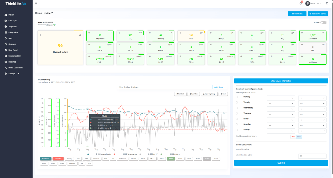
Set the historical range around the question you are investigating.
Multiple chart axes give different measurements their own scale.
Use split graphs when individual trends are easier to read apart.
Export measurement data or a graph image for your next discussion.
THE HEALTH INDEX IN AIRLYTICS
What do the numbers mean for the people in your space? The Health Index turns complex air data into a clear view of indoor conditions and their relevance to well-being.

First, review the overall Health Index. Color-coded views make the air data easier to understand at a glance.
Then explore the well-being categories, from focus to breathing. They help you connect air conditions with the people who use the space.
Next, review the history alongside your Flair readings. Use that context to guide your team’s next check and explain what changed.
Turn a page of numbers into a conversation your whole team can follow.
Explore the Health IndexCOMPARE SPACES AND CONDITIONS
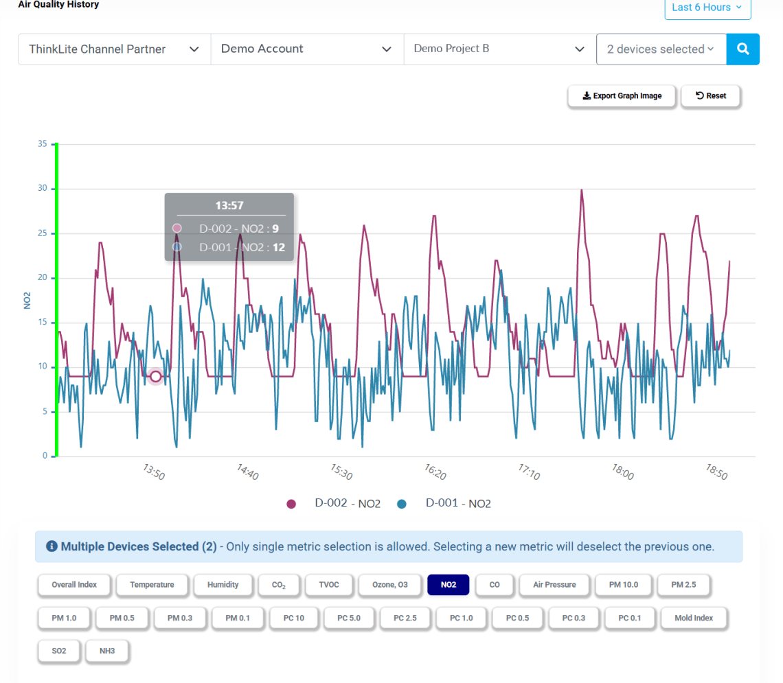
Is a change local to one room, or showing up in other spaces too?
Bring selected Flair devices or groups into a comparison. Review the same measurement across locations, with outdoor context where available.
THE AIRLYTICS WIDGET REPORT BUILDER
Choose the devices, measurements and reporting period. Then bring together the widgets and observations that help explain what happened.


CHOOSE. ARRANGE. EXPLAIN.
Use average, minimum and maximum tables, device or group trends, multi-metric charts and KPI breakdowns. Add notes so the report carries your explanation, too.
Operating-hour settings help focus the report on your selected schedule. Review the aggregation options alongside that setting.
A KPI pie chart represents the percentage of readings in each category—not necessarily the percentage of occupied time.
Export measurement data to Excel for further analysis and your team’s own workflows.
For team updates, save your widget-based report as a PDF with its charts and notes.
You can also save a graph image for a presentation or discussion.
KIOSK & LOBBY VIEW
A clear, shared view for the people in your space. Choose the measurements to display and make the view part of your building’s everyday experience.

Select the measurements relevant to your audience.
Use your logo and background for a familiar presentation.
Use the public kiosk link for your lobby or another shared space.
THE EVERYDAY DETAILS
Keep devices organized, give users appropriate access and follow the conditions that matter to your team.
Set measurement conditions and email notifications. Device-status alerts help your team notice when a monitor goes offline.
Organize Flair devices into projects and groups. Use permissions to distinguish viewing information from making changes.
Discuss your device configuration, available measurements and data integration requirements with ThinkLite.
Open Flair AQM and choose tile or list view to see your monitors together. Use View for a quick reading summary, or Graph View to explore a device’s history.
Open a device’s Graph View, choose a time range and select the measurements you want to review. Use a combined graph to see trends together, or Split Graph for side-by-side charts.
Open Compare, select your devices or groups, and choose a measurement and time range. Review the trends together to spot differences between rooms, floors or buildings.
Choose Create Airlytics, select your devices, measurements and reporting period, then add the widgets you need. Bring together trends, summary tables, KPI breakdowns and your observations in one report.
Export measurement data to Excel, save a completed Airlytics report as a PDF, or use Export Graph Image to download a chart. Choose the format that fits your analysis, presentation or team update.
Choose the devices and measurements to display, then customize the view with your logo and background. Open its public kiosk link on your lobby display to share air quality information with occupants and visitors.
AIRLYTICS FOR YOUR BUILDING
Tell us about your spaces, your Flair monitoring needs and the questions your team wants to answer.
Tell us about your project using the form below.
Loading the inquiry form…
Form not showing? Open the inquiry form in a new tab ↗
EXPLORE THE THINKLITE AIR SYSTEM
Connect air-quality insight with the monitoring and purification solutions that fit your project.
MONITOR THE ROOM

Follow indoor air measurements in the spaces people use every day.
Discover FlairMONITOR INSIDE HVAC

Review air conditions inside the HVAC system before air reaches occupied spaces.
View In-Duct FlairPURIFY FROM THE CEILING

Bring air purification and LED lighting together above the room.
Explore PuriluxPORTABLE PURIFICATION

Explore a freestanding air purification option for your indoor spaces.
Meet ICONNeed the full system view? Visit the ThinkLite homepage
© 2026 — ThinkLite. All Right Reserved.